20.109(S20):Examine qPCR results and complete data analysis (Day8)
Introduction
Throughout Module 2 you have used two datasets to study the effect of etoposide treatment on cancer cell lines (DLD-1 and A549). In the previous exercises you examined gene expression in each cell line. Today you will use the skills learned to compare gene expression across DLD-1 and A549.
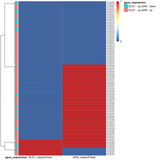
As an introduction to how you will discuss and interpret the data in your Research article, let's work though the below figure:
In this figure, the DLD-1 (left column) and A549 (right column) datasets were compared and the top 100 GO terms that contained significantly enriched terms were identified. This is different from the figures you generated in the previous exercises as these data are not specific to up or down-regulated genes, rather the overall change across the genes within the GO term was considered. Now that we understand the scope of the data, let's look closer at the specific information provided in the figure.
First the results shown in blue and red represent significance according to the p-value (blue to red scalebar to the right of the figure). In this representation the data are shown as either significant (blue = 0 on scalebar) or not significant (red = 1 on scalebar). Given that the bars in the top row are blue for both DLD-1 and A549, the interpretation concerning the data for this GO term (GO term ID labels are included to the immediate right of the image) is that there are significant changes in expression for the genes within this GO term in both DLD-1 or A549. Remember that this does not denote if the expression of the genes within this GO term is increased or decreased, just that expression is different compared to the control (no etoposide) for each cell line. With this, is there any information that can be gathered from the figure regarding the changes in gene expression for this GO term? Yes! On the far right of the image there is a legend for the coral and turquoise color coding. This information corresponds to the bars on the left side of the figure. Let's again look at the bars in the top row. The turquoise bar indicates that for DLD-1 the overall change in gene expression for this GO term is increased whereas for A549 the overall change in gene expression for this GO term is decreased. Therefore, this GO term would have been located in the GOUp table for DLD-1 and the GODown table for A549. Lastly, on the far left of the figure is a dendogram. This type of clustering analysis is used to group samples / populations based on similarity. Only the largest three groupings are shown with the smaller groupings collapsed to eliminate excess clutter from the image.
Now it is your turn. Consider what these data mean for the group of GO terms that are blue in the DLD-1 column and red in the A549 column? Red and red, respectively? Red and blue, respectively?
Given the information provided in this figure, how might you discuss and interpret these data? Overall it is difficult to speak to specifics in these types of analyses. The take-home message is in the trends that are readily apparent. In this figure it is apparent that the enriched GO terms are not entirely consistent across DLD-1 and A549. Instead these data show that there are both similarities and differences in how DLD-1 and A549 cells respond to etoposide. Why might differences exist? The most obvious reason is that the cell types are different. Another possibility is that the etoposide treatment conditions were different in the two experiments. What other reasons could explain the variability seen in gene expression across these two datasets? What information can be gathered from the GO terms that are consistent across these two datasets?
Next, consider what these data mean regarding the success of the experimental approach. Do the inconsistencies indicate the approach is flawed? Absolutely not! Analysis involving big data is a means for gathering information that can, hopefully, inform future more fine-tuned experiments. In this, any information is useful. If you were to design a follow-up experiment from these data, what GO term would be your focus (just considering the color-coded patterns, not the actual functionality)? Why is that GO term interesting? What information might be discovered in studying that particular GO term?
Protocols
Part 1: Analyze RNA-seq data
Today you will complete your analysis of the RNA-seq data sets!
Complete Exercise #4 developed by Amanda Kedaigle, Anne Shen & Prof. Ernest Fraenkel. In this exercise, compare the RNA-seq results for DLD-1 and A549 to identify similarities and / or differences in gene expression that exist when cells are treated with etoposide.
Next day: Enrich candidate clones using fluorescence-activated cell sorter (FACS)

